Tuesday 29 March 2011

22nd March - 25th March 2011

Reflective Practice
All the presentations were finished and were ready to be presented, The most impressive presentations I viewed today were: "The Graphic language of Neville Brody" by Mary, "Si Scott" by Catherine and "Herb Lubalin" by Zoe. I feel that these presentations were impressive as I think that the artists mentioned could be an influence to me in the future and I can already link them to my current work and the style that I work in.

I can heavily relate to Si Scott as he has taken the same route as me when he was training to be a graphic designer. He started off studying a BTEC in Graphic Design an then went on to completing a Foundation Degree in Visual Communication. This give me the sense that if he can become successful why can't I.
 

http://www.top6x6.blogspot.com/

Before today I had never heard of the logo designer, Herb Lubalin. I feel that I work in the same style as him, in the sense that he is influenced by the Bauhaus. He also uses a grid system which is similar to the way I work. As part of the Reflective Practice module I was asked to research a success story in graphic design, I chose the Swiss design movement, by choosing this design movement as a success story it made me realize that I already use a grid system when designing my work.

You can see the grid system in use in the "Coope Union" logo below. I feel that Hurb Launalin is a success in Graphic Design because he has created a large amount of work which has influence great amount of designers, reflecting back to the presentation my favourite logo is the "Families" logo on the top right, I like how Lubalin has taken advantages of the two letter "I" and the letter "l" to created a quirky but effective logo.

http://www.creativereview.co.uk/cr-blog/2009/
october/inside-the-herb-lubalin-study-center


The Graphic Languages of Neville Brody.

Neville Brody has produced a wide range of different design ideas whilst being a Graphic design, from CD artwork, typefaces and magazine design. I feel that I can link my own work to that of Neville's, Neville has designed CD covers, during his time at Fetish records, which were inspired by the Futurists, a movement that I feel strongly about and believe has and definitely will influence me in my future work. After completing a case study I have been able to consider a closer look into what the aims of the Futurists were, and how the social conditions at the time limited their progression as a movement. 


8 Eyed Spy by 8 Eyed Spy, FR 2003, 1981.
http://www.johncoulthart.com/feuilleton/2006/04/23/
neville-brody-and-fetish-records/


Both of these pieces of artwork show signs of inspiration drived from the Italian Futurists movement.
They both show tone, colour and the use of geometric objects similar to the work of Fortunato Depero and Giacomo Balla, two leading practitioners of the movement.


I think that the content of theses presentations were good, but I think Mary was the best at presenting her presentation, I believe that it is essential for any designer to have the ability to present a presentation confidently. I feel that if a designer can confidently make a presentation, the client will be re-assured that the designer knows enough about the brief he is pitching.


Creativity and Social Context and Exploring Specialist Pathways 1.
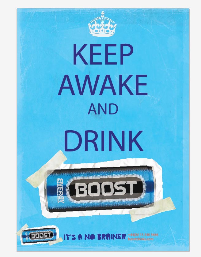
I don't really have any reflections as such for this week, as per last week we are still completing the final refinements to the Boost brief for the YCN. I am not totally pleased with the final outcome of my YCN work I feel I have rushed the brief, I think that if I get the opportunity next year to choose a YCN brief I would, by having a brief from a national competition, I believe it may improve the weight of my portfolio.

 
Professional and Contextual Studies 1
STRIKE!!!

Tuesday 15 March 2011

BERLIN TRIP

The Pentagram Stduios

The Bauhaus

The Tacallses

14th - 17th March 2011

Reflective Practice
Today I handed in a second draft of the Swiss Design presentation, I was told yet again I would need to improve the presentation. I needed to include more recent examples of the Sans Serif typeface set in the flush-left and right rigged text formation and the use of the grid system.
After being consulted about this I went to the library and found a book(Contemporary Swiss Graphic Design) with a varied variety of good example of both the grid system and the San Serif typeface set in the flush-left and right rigged text formation.

Creativity and Social Context
Now all the minor adjustments are complete for the Italian Futurist essay, I now need to work on linking the essay more to the social conditions that effected the Italian Futurist movement. For this I have decided to investigate into whether the Futurists had a major impact on printing techniques during the 1920's - 1940's, I came to this conclusion from analyzing a design for a visiting card by Fortunato Depero. In this artwork Depero had precisioned the type in an expressive manner as opposed to the conventional way, I believed this may have been the result of new printing process at that period.

Exploring Specialist Pathways 1

Today was set aside for finishing the final refinements for the YCN brief, below I have attached two different screen shots of my designs for the energy drink poster. The idea of these came from the world war two propaganda posters 'keep calm and carry on' The first design is one of my first visuals using the 'no brainer' type that Boost wanted me to use, I didn't like the wording in this design as I felt it didn't portray the message Boost wanted to convey to their new target market I also didn't like the typeface used.
In design two I have taken more time to make the visual appear more like the 'keep calm and carry on' posters seen in my research folder, I changed the wording which is more coherent with Boosts message and I have also strayed away from the typeface Boost stipulated, instead I have used the Helvetica.
I undertand if a client askes for a certain typeface you should use it, but I feel it does no harm in designing an alternative for them to anaylise.


Today I finished my screen prints and started the collograph, examples of both of these can be found in my type brief folder. I think the collograph printing technique is a good technique to know but I dont think I will be using it in my current type brief. The process itself is time consuming and the effects of the final outcome can be unreliable.

Wednesday 2 March 2011

1st March - 3rd March 2011 - including Informtation on the Italain Futurists, Russian Constructivism, The New York School, Art Deco, New Wave and David Carson

Reflective Practice
In today's lesson I handed my 1st draft of the presentation, Neil informed me that it would be essential for me to improve on the presentation, I was told that I needed to include more imagery to help reference the facts I was including in the presentation.

Creativity and Social Context
Today I presented my PowerPoint presentation on the Italian Futurists, for me presenting PowerPoint's or case studies to a group of people is always a nervous time, but I feel I have progressed largely since starting this course. On many occasions I have been given short notice, e.g. presenting a group critique of my work to the group, I feel having the short notice enforced on me has help me develop my presentational skill, as I have had less time to worry it. I also submitted my first draft of the case study, I think submitting this first draft has enhanced my skills of compiling a case study and has also changed my perception of how a case study at degree level should be. On reflection the ways of improvement I was given needed small attention, the improvement measures I needed to take were to improve spelling and largely to place the case study in chronological order.


Art Deco
1920's - 1940's
Art  Deco started around 1920. It represented the rapid modernization of the world. It was used in fashion in the united states and in Europe. The name for Art Deco derived from the 1925 'Expositon Internationale des Arts Decoratifs Industriels et Modernes' held in Paris. It was named Art Deco because of the decorations used in the festival,(Arts Decorafits)
Art Deco was only used in art as a poster but its design was also used in architecture, furniture,fashion and car designs.


Leading artists of this movement were:
A.M. Cassandra, Rolan Ansieau, Sonia Delaunay, Tamara de Lempicka, Edward McKnight Kauffer, Koloman Moser, Aleksandra Ekster and Robin Howlett.


Leading architects were:
William Van Alen, Joseph Strauss, Irving Morrow, Charles Ellis, John Eberson and Albert Khan.
Recongnizable Art Deco fonts can be found on www.fontspace.com/category/art+deco


I don't think that the designers and artists of the Art Deco movement will influence me in my future work, I also feel that I am not as closely linked to this movement as I am to other past art movements.

David Carson and New Wave.
Wolfgang Weingart was one of the most influencial designers to make a journey into the New Wave movement. He envisioned a more experimental and expressive style of typography.
The three main disciples Weingart admired when he started practicing New Wave were Dan Friedman, April Greiman and Willi Kunz. Their work was so admired and imitated that it was the basis of the "New Wave" typography in the 1970's and 1980's. The Characteristics of this anti-movement were letter spaced Sans Serif type, stair-step rules, diagonal type, dynamic use of space, the use of weight changes or italics within words and reversed type.

David Carson is an American graphic designer who is best known for his unique magazine designs and use of experiemtanl tyogrpahy. Carson spent his early adulthood as a professional surfer and attained a standing in the world surfing chamionships while he worked as a high school teacher in California.

David Carson and his work have been recognized world wide and featured in over 180 magazines and newspaper articles. His work has proved popular with a number of people such as feautures in the Newsweek magazine where David has produced many designs.


David Carson
David Carson completed a substantial amount of work during his career along with Neville Brody, I feel that I can certainly relate and create links with my current and past work. When I design type I prefer it to be placed conventionally and I thought that this was the only way could work, but recently when I have looked at the work of Brody and Carson I feel that laying type out expressivly can make a design effective, the artwork "don't mistake legibility for communication" by David Carson is a good example of this.

The New York School 1950's - 1970's.


Key words.
Bubbly, Hand Drawn typefaces.
Psychedelic. 
Bright colours.
Wavy lined posters.
Festivals. 
Electric guitar amps and louder sounds.


Work during this time included: branding and corporate idenity and work for Coco Cola.


The wavy lines and bright psychedelic colours did not appeal to me. I my current work is not linked to the movement and I do not think my future work will be inspired from this movement.  

Professional and Contextual Studies 1
Being a Sole Trader.

Free lance - makes you personally liable for any debts.

A partnership - two or more sole trader working together.

Limited liability partnership or company

- As a partnership or company debt is limited to the company.
- fees are charged to establish a company or to register a trading name.

Franchises

- A license to an existing business.

Setting up the finance to be a sole trader.

- 6 months finance is usual but not legal.

Contracts

- Pre arranged contracts to guarantee work.

Funding.

- grants, loans, private investments.

- overdraft facility.

- charge a percentage upfront.

Tax issues.

- sole traders, partnerships and LLPs only charge tax on profits.
- equipment, costs, rent, phones and office costs are deducted from tax.
- Tax return is completed by 1st April each year of trading.
- you must register within 3 months of a fine will be charged.

Corporation Tax

- charged to limited companies on profits.
- if your business earns more than £64,000 then you have to register for vat.


Before becoming a sole trader.

- build a base of clients whilst working.
- attend conference or network events.
- join a agency.
- start a blog or web based marketing website.

Advantages.

- freedom.
- creative control.
- pure profit.

Disadvantages.

- stress.
- hours of work you do.
- marketing.
- chasing pay.
- deadlines.
- life/work balance.
- isolation.
- liability.