After attempting to research the Helvetica typeface during the past week, I was unable to collate a substantial about of research on the subject.
After searching the Internet, I was unable to acquire a source that provided me with the relevant information I was looking for, I had the same result when searching the library.
I thought that at this point it was acceptable for me to find another success story to study before I would start to fall behind the rest of the group.
I had recently purchased a copy of Megg's History of Graphic Design, in that I came across the Swiss design movement, also known as The International Typographic Style. I have decided to study this as my success story. I feel that it has been a success as it has been influential for future movements.
Creative and Social Context:
The De Stijl
The ideas of De Stijl started when a group of artists, which included 3 painter, 2 artist, 1 sculptor and a poet, came together to exchange ideas in a public forum.
They vehicle for the exchange was a monthly magazine called 'De Stijl'. The magazine was founded in 1917 in Holland, but ceased publication in 1931 when the founding member died. The founder was Theo Van Deasburg, he was also the publisher and editor of the magazine and the movements main spokesman, without him De Stijl as a movement fell apart.
The Manifesto
De Stijl was founded during World War 1 and its origins were in a neutral country. The artist of De Stijl wanted harmony in balance, De Stijl came out of a period of chaos, when harmony and balance was longed for by the majority of Europeans. It was clear that for future harmony, implied changes in ways of life. The Artist discovered theses changed everywhere in contemporary life.
The New Typography
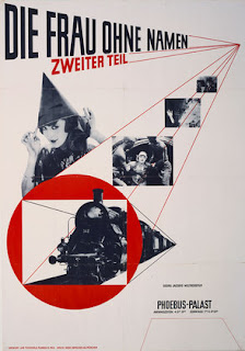
The New Typography movement brought together information design and graphics to the artistic avant-garde of Central Europe during the 1920's and 1930's. The leading practitioner of the New Typography movement was Jan Tschichold, his idea was to forget the old ideas of design and develop new ones.
 |
| Jan Tschichold. Die Frau ohne Namen. 1927. Offset lithograph |
Bibliography:
http://www.moma.org/visit/calendar/exhibitions/1015
[accessed 02/03/11]
The New Typography, Creative Review 1995
Summary.
Out of the two manifestos I have studied, I feel I like the most and can relate to more is the The New Typography manifesto by Jan Tcshichold. The New Typography movement came directly after the first version of the Italian Futurists, I believe that the Social conditions at that period helped with the progression of many influential designers. I think that the colours they used and the theory behind it(which is mentioned above) is a admirable system to use. [insert my lino print work]
Exploring Specialist Pathway 1: The breaking the rules.
In the past when people have stated, 'Brody and Carson really broke the rules of typography', I never fully understood what they meant by that. I feel that today's workshop was a essential as it has enabled me to understand this.
Out of all of the different examples of rule breaking I have encountered I feel that 'breaking the rules of balance' would be the most inspirational for me in my future work. I believe this because I feel that the word 'type' as it stands below is strong, I think that this style of rule breaking would work effectively in a magazine or a advertising poster and would appeal with the most potential to a consumer.
 |
| Breaking the rule of balance |
 |
| Breaking the rule of distortion |
 |
| Breaking the rules of width |
Screen Prints
I went to today lesson knowing nothing about screen printing, my initial reaction was that I thought screen would be unnecessary, but on reflection I feel that it could be an essential aid in future typography briefs.
I believe that learning traditional methods of design and collaborating them with modern methods can create a effective piece of artwork.
No comments:
Post a Comment