Tuesday, 23 November 2010

Post Office 24th november

Starting today's lecture made me realise that we only have two week until the deadline, I think with briefs in the future I need to prepare a plan for my work and spend time at home working though a brief as i think i did not allocate enough time for this.
I think I now have sufficient research into bar/cafe/restaurant menu and websites as a was lacking this before. Its good that I have have this research in my folder as it will provide guidance into what colours and type is required in my design system, from analysing the research I gathered, I have established that most menus and website for the bars/cafe/restaurants use light friendly colours and a welcoming sophisticated typeface that is usually condensed to medium bold. I have spent the majority of today's finishing my first business card and i now have a finished logo for the Post Office.


Thsis is my finished logo.


Before I applied it to my first draft of my business card, i removed the background. by having the background it gave my logo a square outline which did not look right.

Post Office 17th november

My main goal for today was to have a completed logo for the Post Office. I initially decided to try different formats and layout with the wood block prints, I have chosen to continue using the wood block prints in my logo because I believe they show a sophisticated and modern look. I originally considered the notion of wood block prints when I was reflecting back on the visit we had from Kerry Ostermeyer. Kerry works for a design company called KO creative, which is based in Stafford, They have produced work for companies across the country, big and small. The one piece of work that interested me the most was that of Mr Popple's. Mr Popple's creates chocolate from organic ingredients, he approached KO with the idea of a new brand for the company. KO came up with the idea of printing the logo on to the packets using a rubber stamp. You can find my blog entries overlooking the talk under "KO Creative talk - 12.10.10".

I think this brief will help me in my future work and studies, using traditional methods like the wood block prints has made be realise that the computer is not a essential part of designing but a tool in aiding designs.

Individually we also received the aid of ex-students who studied the Foundation Degree last year, who are currently working freelance along side their BA Hons in Graphic Design at Staffs Uni. I considered this to be a advantage and appreciated their help from the start. They also brought with them their folder and design work for the Post Office which we are currently working though. Having analysed their folder work it  made me realise that it was essential for me to progress in my research work and further my annotation and initial designs skills.


niel 16th november

Today I presented my PowerPoint presentation on the German designer Erik Spiekermann, a presentation that I had been working on for some time. Ive always been very nervous when participating in presentations, especial when it includes talking to a large amount of people, I feel I reacted very well when presenting my PowerPoint, I had a well structured PowerPoint which held minimal bullet points on each slide, allowing me the option to expand on those point through out the talk.

If I was permitted to make a second attempt at the PowerPoint I would diffidently attempt to expand more on the bullet points include in my presentation as I feel I lack in this, I would also contact at least two other designers using a wider range of communication techniques as I did not receive an answer to the questions I asked.

What is a success in Graphic Design? 23rd november

My opinion on this issue is that Graphic Design itself is a success, everything around us is a piece of Graphic design, without it
  Everything would have to be painstakingly written by hand. Without designs process and ingredients - structure and organisation, word and image, differentiation - we would have to receive all information by spoken word. We would enter another Dark Age,a thousand years of Ignorance, prejudice, superstition and very short lifespans.
(Newark, 2002, p6)

Meanwhile other memebers of the group agreed that Graphics is successful by revenue, its how good you are and how your reputation is seen to others. Many current graphic designers follow designers of the past to influence their current work.

Another argument was raised on the concern that i perviously made, over time graphics has been a success itself but we have lost the traditional methods used in graphics and designers use the aid of computers when approaching thier work.

Monday, 22 November 2010

Iain/Simon 15th November/ 22 Novmber

I was not enthusiastic about the first format I discovered from the "Magazine Design" so I decided to change to a different idea similar to the picture on the left. The layout below consists of a grid system,


I started off by creating a grid in InDesign itself, and I made sure the picture and text stayed in line with the grid. Every page in my InDesign document is fairly consistent, keeping the text in the bottom right within the grid system and the having the pictures and main headers bleed off the page.
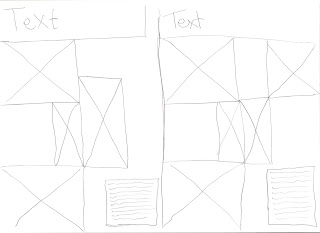
This is the initial pencil drawing for my layout
I feel it was worth spending time trying out 2-3 different layout for my page as once I had the layout implemented I could easily place all of the text and imagery into place.


extract from plan for Journey book
I felt it appropriate that I should start a plan for my journey book, so that I would not be designing the pages from memory. I acknowledge that this has helped me from the start, I think that I should implement a plan for all of my future briefs to aid me with time management.

Overall I feel I am on target to finish for deadline for my experiemtal and Journey work, but Im behind on my InDesign document.

Tuesday, 16 November 2010

niel 9th november - semimar - Is Graphic Design art?

The point I indicated in this seminar was the Graphic Design can be Art, but it depends what type of Graphic Design it is portrayed as. For example, the work of Neville Brody can be seen as art. I personally think Graphic Design is a form of Communication, informing people about service available.

Monday, 8 November 2010

Post office 3rd November

Started today by trying some new design ideas by experimenting with wood blocks from the print room. I started to experiment with 3 different types of wood block, a condensed typeface, a serif type and a sans serif typeface. I experimented with all of these typefaces in different formats and layouts, but i stayed with the condensed style typeface that you can see to the right. I decide to call the venue No.35 as i thought it showed the sophication of the venue as to calling it "The Post Office"
During my 1-2-1 tutorial with Barney, he talked about my logo being to similar to the one of Jack Daniels and that people who would be going to the Post Office may not want to be associated with Jack Daniels, he suggested that I experiment with different typefaces and layouts. In next weeks lecture he said we would need to do a presentation of our work to date, he gave me a checklist of things i needed to complete;
  1. layout the different section of my folder in accordance with the brief.
  2. Reference system so i only have to reference once on a single page.
  3. Annotation of logo research.
  4. Annotation of Initial designs.
  5. Research into artists that influence me.
  6. complete market research.
  7. Play with logos more.
  8. research business stationary.

niel 2nd november

Don't really have much to reflect on from today lecture. I started to prepare some research and questions to ask my designer. Ive decided to study the German type designer Erik Spiekermann, Ive sent him an email explaining who I am, what work of his I like and if he had some spare time, would he mine answering some question i had. Below I have attached the email I sent him.

I feel I have structured the email in an appropriate way  and I hope I receive a reply from him.


simon/iain 8 november

Started today's lecture by considering different formats and layouts for my InDesign PDF book, After searching different websites, I was unhappy and could not find the right format for me to express my InDesign skills to a future employer. I decided to visit the library to further my investigations into magazine  and book layouts and formats. Whilst in the library I came across fantastic called "Magazine Design" from this I then discovered a layout that suited my work.

I think that using books from the library, especially the "Magazine Design" book will help me in my future studies.
This is my proposal for my concept of the "Journey"
In Iains part of the lesson, I completed a 1-2-1 outlining my faults and what I would need to achieve before the next lecture. He planned out that I would need to complete my experimental work as soon as possible and start my plans and preparations for my Journey book. 


Monday, 1 November 2010

Scott Tucker Sketch Book work from 2007 (iain/simon 1st november)

After re-reading the brief I realised that I had not research into other artists that inspired me enough, I decided to go back to the list of artists, and came across a designer called Scott Tucker. Scott Tucker works with pens to create doodle pictures, he also tries colour pencils and pen with the aid of photoshop to create good pieces of artwork. I am not the best at drawing in detail, so I think that Scott Tucker is a good artist to take inspiration.
In Iain's lesson I feel I have gradually improved my skills in my experimental sketch book, I have started to experiment with bus tickets by enlarging them to the point that the picture becomes grainy. I thought this techniques created a good effect and I may use it in my Journey sketch books. I thought using bus tickets was appropriate as my journey would be a bus trip from my house to Stoke city centre.


2.17.07 - ink, photoshop
- dinner, after life drawing at SF Art Institute, North Beach

Tucker, S.(2007), ink, photoshop
- dinner, after life drawing at SF Art Institute, North Beach[online], available from http://scotttucker.com/sketchbooks/feb/3/
[accessed 11/11/10]
3.5.07 - doodle -ink
Tucker, S.(2007), doodle ink[online], available from :http://scotttucker.com/sketchbooks/march/1/
[accessed 11/11/10] 


1.21.07 - on break from recording arts class
felt pin
 Tucker, S.(2007), on break from recording arts class felt pin [online], available 
fromhttp://scotttucker.com/sketchbooks/jan/3/
 [accessed 11/11/10]